Guiding citizens online towards their answers
- Client
- City of Rotterdam
- Period
- June 2018
- Duration
- 6 weeks


Rotterdam is a city with around 640.000 inhabitants who face different challenges, questions and problems in daily life. The city offers help in a huge number of areas, ranging from providing social contact to helping people who have become homeless.
The difficulty is, this assistance takes place in different areas of the city depending on the question, age and neighborhood of the resident. Usually there’s only one right place for someone to go to.
Some information desks are better known than others which leads to about 35% of people ending up in the wrong place. This project was started to increase the self-reliance of civilians and thus decrease that percentage.

During this 6-week project in Rotterdam, I worked together with four other people. Two Mendix-developers, one business analyst and a project manager.
My role was described as ‘the guy that makes things pretty and usable’. Even though that’s partly very accurate, I got the feeling the expectations weren’t aligned properly.
In the first few meetings we had, I was able to make it clear that I was also going to challenge the work already done. My responsibilities didn’t start at visual design, they started with the information architecture.
As a UX Designer, you empathize with the end user. You try to get into their shoes, looking at the product you make. But this time, even in my own shoes, I had trouble understanding the information architecture of the product. I felt something was wrong.
What was odd, is that every flow was linear. You could only choose one category at a time but you had to answer a lot of questions, even if they weren’t applicable.
This meant no room for errors and no room for cross-category issues. It completely contradicts the research I read through and conversations I had, stating citizens almost always have more than one question/issue to be helped with.
Early on I felt this project was too much solution based. Unfortunately, I couldn’t change the direction. The project was already started and budgets were being spent. What was left for me was to create the best possible interface for this existing solution and in between, advise for other possible solutions.
A quick glimpse on the initial structure made me realise a lot of work needed to be done before I could start working out interfaces. The structure was completely linear and entirely dependant on the interpretation of category names. It left no room for error and made it impossible to give people advice on multiple questions at once.
Both the formulation of questions and the corresponding advice were written in a way I thought wouldn't resonate with the end user. Too much words, too difficult words and too sophisticated sentence structures. People told me it was checked to be B1 level, “so it probably would perform well”. But I didn’t want to take that for granted.

As a designer, my gut told me the current structure would certainly fail but my words didn’t convince others. After all, I was both the newest and the youngest member of the team.
What also didn’t help was the fact that it took about 6 months for this structure to materialize. A lot of effort was already put into it. I felt this might not be an easy battle to win, but certainly the most important one.
That’s why I sat down with the lead developer to figure out parts he could already start working on that wouldn’t be affected if the structure would eventually change. In the mean time, I started testing the current product to find the largest and quickest wins possible.

A question that kept popping up in conversations was if we should use icons or images for the categories. Personally there were way more important questions, but I took this as an opportunity to ‘secretly’ test the categories themselves too.
After quickly creating three prototypes by tweaking the city’s existing website, I went to central station where I talked to nine people of different ages and backgrounds. In total, only 35 questions were answered, but the results spoke volumes.
Icons performed better than images: people made quicker and more accurate decisions. The most important thing though, was that I got the green light to start adjusting the categories. Also, my advice to get rid of the linear structure was seriously considered.
After a few conversations, I figured out the categories in question are also used by civil servants to categorise their internal departments. It makes sense they started off with these and it also makes sense they didn’t work for civilians.
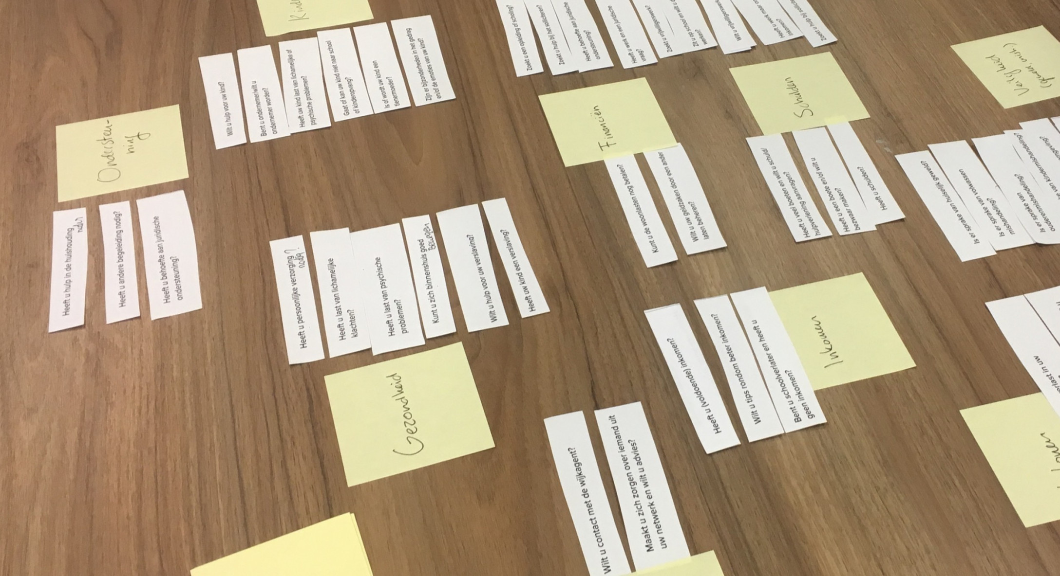
To get relatable categories for citizens, why not ask them? I organised a card sorting session, printed out all the questions, asked seven people to group them and to give those groups names.

The previous two tests brought to light the fact that users had trouble understanding questions. Also it gave me a better understanding of the language people used. This helped me getting permission to rewrite the content.
In this test I also wanted to find out if situations would work instead of questions. What if people could select a few situations that are applicable instead of answering all the questions seperately with yes or no? It might increase the ease of use and it would allow us to give all advice at once in multi-issue cases.

Before making desicions about layout, I start sketching as much ideas as possible. With this I try to explore the limits so I won’t miss out on promising solutions that are less obvious.
I generally try to separate certain phases in the design proces to gain speed and quality. For example, generating ideas is easier when not having to worry about visual design. Or, creating interactive prototypes is faster when already determined what they’ll look like.

Now that I had confidence in the information architecture, I wanted to create a higher fidelity prototype to collect a new type of insight. Normally in this stage, I would create visuals and assemble an interactive prototype with InVision or Marvel. But, as I mentioned before, it’s extremely valuable to test with the real situation of the end-user. Therefore, I decided to create an interactive prototype with HTML, CSS and JavaScript to be able to cover all situations.
The nicest part of this assignment, was the ability to test with real end-users in real situations. The city allowed me to go to an information desk and talk to people that came there for help. This meant every scenario was possible and the already stressed citizens didn’t have to put themselves into someone’s seat.

What characterizes my design process most, are itterations, quick and often. Doing assumptions is a good way to gain speed, and then I try to test those assumptions as quickly as possible to make sure I’m going in the right direction as well.
The assumption made by team members up until now, was that we should only show one question at a time. Else, it would be too overwhelming. I wanted to test that by placing all questions in a long list with a sidebar to filter on categories.
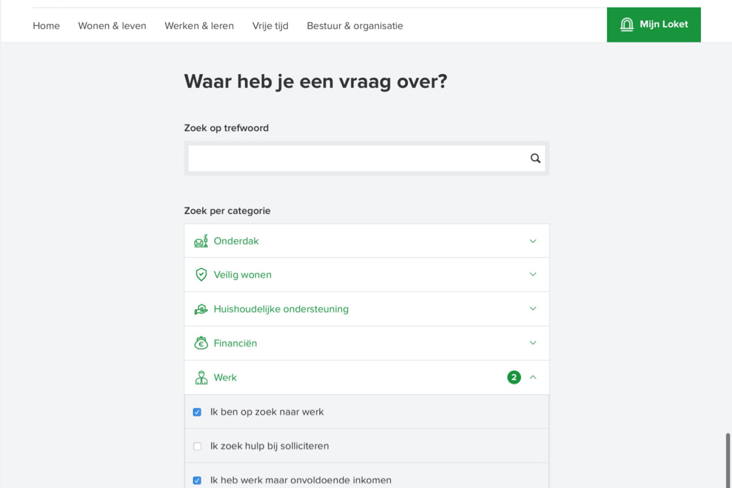
Bringing the categories and situations closer together in the interface emphasises the relation. It also decreases the chance people fail to see the functionalities, and it increases the scannability of the entire page.
I must admit I was a bit worried about the fact that the situations were hidden. My assumption was that people would have difficulties discovering all content.

During usability tests people got stuck at the search bar. Even though it was ment as a supportive feature, almost everyone used it. Because of its size and position the search bar got turned it into the primary way to navigate the situations. Changing those two properties immediately fixed it and showed that the accordion worked very well, exceeding my own expectations.

Unfortunately, from the start there was no room to discuss the chosen solution. A pitty, because after doing user tests, I felt more and more like we had only solved a part of the problem.
Most of the people I talked to didn’t want to participate in the user tests. The most common reasons given were a lack of digital skills, not speaking Dutch and not being able to read at all. This convinced me, a web app won’t solve their problem.
That’s why I did a workshop with fellow Zeewaardig colleagues to be able to advice the city about ideas for different touch points if they would decide to further develop this project.